
How to Choose a Color Palette for Your Home
A Complete Guide to Creating Cohesive Interiors
7/19/20269 min read


It can be rather overwhelming trying to decide which colors you should choose for your home when surrounded by an abundance of paint chips and confusing information. However, the way to make sure that you pick a winning color combination is to know some basic color theories, consider the lighting and functionality of spaces, and come up with a harmonious plan for decorating your home.
Color Wheel Relationships
The color wheel reveals specific patterns that produce reliable color schemes.
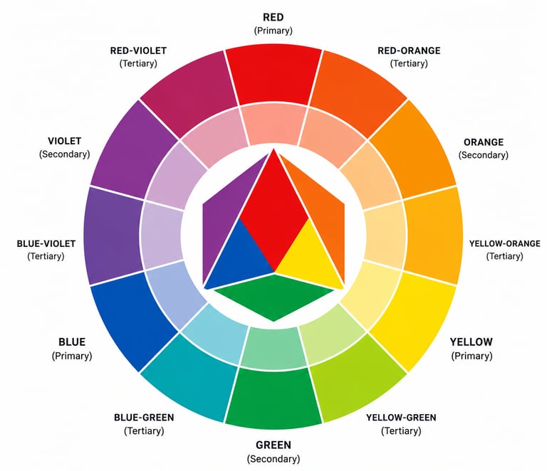
Complementary colors sit directly opposite each other on the wheel, such as blue and orange or red and green, creating high contrast and visual energy.
Analogous colors occupy adjacent positions on the wheel and share similar undertones. A scheme of blue, blue-green, and green produces a harmonious, cohesive look that feels natural and restful.
Triadic relationships connect three colors spaced evenly around the wheel, like red, yellow, and blue. These combinations offer vibrant contrast while maintaining balance. Homeowners can use these established relationships to select colors with confidence rather than relying solely on instinct.
Warm and Cool Tones
Colors divide into two temperature categories that significantly impact how a space feels.
Warm colors: reds, oranges, yellows, and their derivatives. They advance visually and create energy, making them suitable for social spaces like living rooms and dining areas.
Cool colors: blues, greens, and purples. Recede visually and promote calm. These tones work well in bedrooms, bathrooms, and offices where relaxation or focus is desired.
The temperature of the color affects the perception of the room size and the quality of lighting. The warm colors are good for making large rooms cozy; however, in small rooms, the warm colors might be too overwhelming. On the other hand, cool colors make visual perception more spacious, and the rooms seem bigger. Additionally, consider natural light exposure when selecting temperature, as north-facing rooms benefit from warm colors while south-facing spaces can handle cooler palettes.
A great place to see different color palettes is Adobe's Color Palette website. This is where you can explore by themes, colors, moods, and more.
Identifying Room Influences


A color scheme is much more than an element that adds aesthetics to the space. It can change moods, define spaces, and create harmony among spaces that are quite different. Whether or not the house looks like a coherent whole depends on the use of colors.
This guide breaks down the process into manageable steps, from grasping fundamental color relationships to identifying the unique characteristics of each room. Readers will learn how to align colors with their aesthetic preferences, apply proven formulas for balance, and test choices before committing to final decisions.
Understanding Color Theory
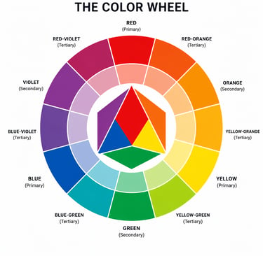
Color theory studies the interaction between colors as well as their relations with each other, thus becoming an instrument to make sound decisions about the palette of your house. The main instrument used by color theory is a color wheel.
Testing and Refining Your Palette
Before committing to paint purchases and room-wide applications, you should test your color selections in actual living conditions. Light, surrounding materials, and time of day will reveal whether chosen colors work harmoniously together.
Sampling Paint and Materials
Paint samples should be applied directly to walls in patches at least 2 feet by 2 feet. Small paint chips and swatches fail to show how colors interact with existing flooring, furniture, and architectural details.
Testing should occur on multiple walls within the same room. A north-facing wall will display colors differently from a south-facing wall. You should also test colors on walls adjacent to different rooms to check flow and transition points.
Key materials to test together:
Paint samples on actual wall surfaces
Fabric swatches from furniture or curtains
Flooring samples or existing floor colors
Trim paint or wood finishes
Tile, countertop, or backsplash materials
Samples should remain on walls for at least three to five days. This extended testing period allows observation under various lighting conditions and during daily activities. Colors that initially seem perfect may appear too bold, too bland, or may clash with furnishings after repeated viewing.
Adjusting for Different Times of Day
Natural light changes dramatically throughout the day, shifting color appearance from morning to evening. A warm beige might look peachy at sunrise, neutral at midday, and grayish at dusk.
You should observe test patches during morning, afternoon, and evening hours. Artificial lighting adds another layer, as warm LED bulbs enhance yellows and reds while cool bulbs amplify blues and greens.
Rooms with eastern exposure receive bright, cool morning light that warms as the day progresses. Western exposure brings harsh afternoon light and golden evening tones. North-facing rooms maintain consistent cool, indirect light, while south-facing spaces get the most natural brightness.
If a color shifts unattractively during specific times, adjustments to undertone or saturation level may resolve the issue. Adding more gray can neutralize unwanted warmth, while slightly warmer bases counteract excessive coolness.
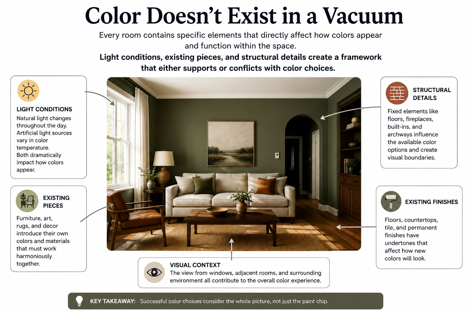
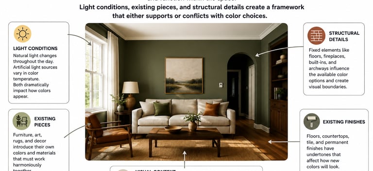
Every room contains specific elements that directly affect how colors appear and function within the space. Light conditions, existing pieces, and structural details create a framework that either supports or conflicts with color choices.
Natural and Artificial Lighting
Color perception varies throughout the course of the day and even into the night because of light sources. Rooms facing north have cool and indirect lighting that could cause colors to appear duller and bluer. Rooms facing south have warm lighting, which intensifies colors and makes them warmer.
East-facing rooms have bright sunlight in the morning but dull light in the afternoon. On the other hand, west-facing rooms are relatively dull in the morning but bright at noon. The result is that the same paint may appear differently when applied to different walls at different times of day.
The addition of artificial lighting makes things even more complicated. The yellowish light from incandescent lamps highlights reds and oranges but de-emphasizes blues and greens. LEDs and fluorescent lamps have a tendency to be cooler, so they will not highlight warmer colors but rather cool ones. You should check paint samples both under natural and artificial light sources.
Existing Furnishings and Fixtures
Furniture pieces, floor coverings, and fixtures set the tone for color accents to come, as the burgundy sofa or honey-colored hardwood floors have set the stage for what color combination will work with the walls.
The use of an object already available makes a convenient starting point for choosing colors. An ornamental rug, piece of art, or cushion has many different colors that can serve as inspiration for the color palette. Choosing colors from this object guarantees that the new palette complements the existing objects in the space.
These fixed features, such as tiled backsplashes, countertops, and cabinetry, have much more significance because of the money invested in changing them. When choosing the colors for your walls, you need to pay most attention to these elements first.
Architectural Features
Color is affected by structural components that enhance its definition and highlight spatial relationships. Crown molding, wainscoting, and ceiling details can either contrast in color for emphasis or remain tone-on-tone to downplay any disruption. For example, high ceilings have a different treatment from standard eight-foot-high ceilings.
Trim color affects the overall impact of wall color. White trim creates sharp contrast and traditional appeal, while trim painted the same color as the walls produces seamless, modern continuity. Additionally, door frames, baseboards, and window casings have enough surface area to function as a secondary color in the room's palette.
Open floor plans require color transitions that maintain visual flow between connected spaces. Abrupt color changes between adjoining rooms can feel jarring, while subtle shifts in tone create cohesion without dullness.
Finding Your Personal Style
Personal decorating style can be determined by looking at particular inspirations, learning about the effects that various colors have on mood and behavior, and matching those colors to the intended function of each room.
Inspirational Sources
Visual references provide the most direct path to discovering authentic style preferences. You should create a digital or physical collection of images from design magazines, social media platforms, and home tours that genuinely appeal to you.
Key sources to explore:
Interior design platforms like Pinterest and Houzz
Home decor magazines and catalogs
Model homes and showrooms
Nature photography and travel destinations
Art galleries and museums
After gathering 20-30 images, patterns emerge in color preferences, room layouts, and decorative elements. You might notice you consistently save images featuring navy blue and brass accents, or that you gravitate toward spaces with abundant natural wood tones. These recurring elements show authentic preferences rather than fleeting trends.
The items already owned also indicate established taste. Favorite clothing colors, cherished artwork, and beloved furniture pieces offer clues about which palettes feel most natural and comfortable to you.
Psychological Effects of Colors
Different colors trigger specific emotional and physical responses that impact daily life within a home. Warm colors like red, orange, and yellow increase energy levels and stimulate conversation, making them effective in social spaces.
Cool colors such as blue, green, and purple promote calmness and concentration. Blue lowers blood pressure and heart rate, which explains its popularity in bedrooms. Green reduces eye strain and creates a restful atmosphere suitable for offices or reading rooms.
Neutral colors provide versatility and balance. Gray offers sophistication without the starkness of white, while beige creates warmth without overwhelming a space. Black adds depth and grounds brighter accent colors.
Color intensity matters as much as hue. Saturated, bright colors energize and demand attention, while muted or pastel versions of the same colors feel gentler and more subdued. A vibrant coral might overwhelm a small bedroom, but a dusty rose version creates a soothing retreat.
Matching Preferences to Room Function
Each room serves distinct purposes that should guide color selection. Bedrooms benefit from colors that support relaxation and sleep quality, typically softer blues, greens, or warm neutrals.
Kitchens and dining areas work well with colors that stimulate appetite and social interaction. Warm tones like terracotta, warm white, or sage green encourage gathering and conversation. These spaces also handle bolder accent colors more successfully than private retreats.
Home offices require colors that enhance focus without causing fatigue. Medium-toned blues and greens support sustained concentration, while small doses of yellow can boost creativity during brainstorming sessions.
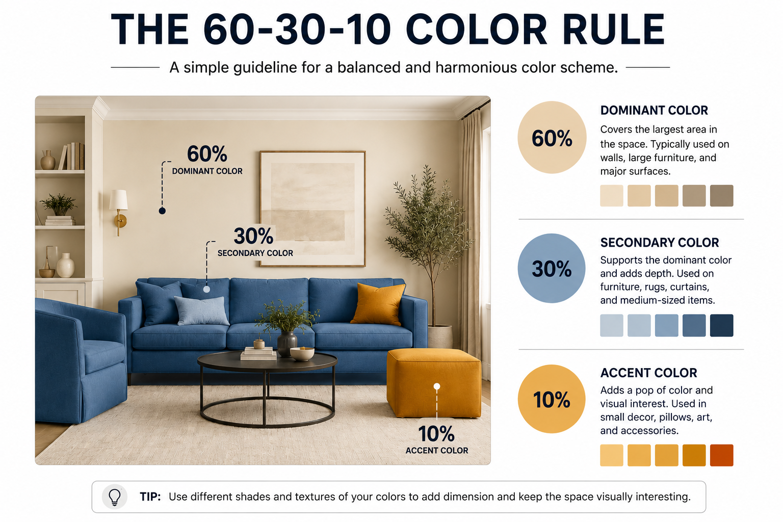
Living rooms serve multiple functions, so they need balanced palettes. A neutral base with interchangeable accent colors allows the space to shift from energetic entertainment to quiet relaxation. The 60-30-10 rule works particularly well here: 60% dominant color, 30% secondary color, and 10% accent color.
Bathrooms can embrace either spa-like calmness with whites and soft blues or energizing brightness with cheerful yellows and crisp whites, depending on whether morning preparation or evening unwinding takes priority.
Building Balanced Color Schemes
A successful color scheme relies on establishing clear proportions between dominant, supporting, and accent shades. The key lies in selecting colors that work together while maintaining enough contrast to create visual interest throughout the space.
Choosing a Dominant Shade
The dominant shade sets the foundation for the entire room and typically appears on the largest surfaces. This color should reflect the desired mood and atmosphere of the space while complementing existing architectural features.
Walls usually carry the dominant shade, which means homeowners will see this color most often. Lighter dominant shades like soft whites, beiges, or pale grays make rooms feel more spacious. Darker dominant colors such as navy, charcoal, or forest green create intimacy and drama.
When selecting a dominant shade, testing it in the actual space is essential. Paint large swatches on multiple walls to observe how natural and artificial light affects the color throughout the day. The dominant shade should feel comfortable to live with over the long term, as changing it requires the most effort and expense.
Selecting Accent and Neutral Colors
Accent colors inject personality and visual energy into a room. These shades appear in smaller doses through pillows, artwork, accessories, and decorative elements.
Neutrals bridge the gap between dominant and accent colors. Whites, grays, taupes, and soft browns provide breathing room and prevent color schemes from feeling overwhelming. These supporting shades appear on trim, furniture, and secondary surfaces.
The relationship between neutrals and accents determines whether a space feels cohesive or chaotic. Two to three accent colors typically suffice for most rooms. Bold accent choices like emerald green, burnt orange, or deep plum work best when balanced with sufficient neutral territory.
Using the 60-30-10 Rule
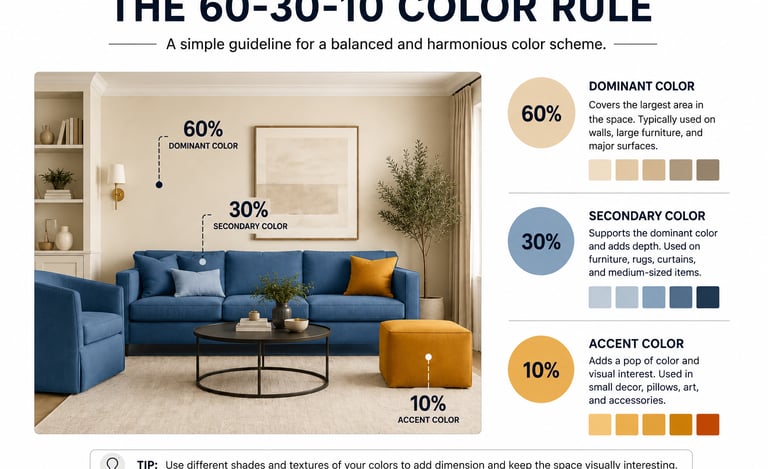
This proportion-based approach divides color distribution into three categories: 60% dominant, 30% secondary, and 10% accent. The dominant color covers walls and large furniture pieces. The secondary shade appears on upholstery, curtains, and area rugs. The accent portion includes throw pillows, artwork, and decorative objects.
Following this formula creates a natural visual balance without requiring design expertise. A room might use 60% soft gray on walls, 30% warm taupe on a sofa and curtains, and 10% mustard yellow in pillows and accessories.
The rule serves as a guideline rather than a strict requirement. Some spaces benefit from adjusting the ratios to 70-20-10 or 50-30-20, depending on the room's purpose and your preferences.
Primary, Secondary, and Tertiary Colors
The color wheel contains 12 distinct hues organized into three categories.
Primary colors, red, blue, and yellow, cannot be created by mixing other colors and serve as the foundation for all other hues.
Secondary colors result from mixing two primary colors in equal parts. Orange comes from red and yellow, green from blue and yellow, and violet from red and blue.
Tertiary colors complete the wheel by combining one primary color with an adjacent secondary color. These six colors include red-orange, yellow-orange, yellow-green, blue-green, blue-violet, and red-violet. Understanding this hierarchy helps homeowners identify which colors naturally complement each other and why certain combinations feel balanced while others create tension.
source: @kommumikation
source: @christina_winter
Image Credits:
Featured images include original Clever Living Spaces photography, AI-generated design concepts, and licensed images from Unsplash contributors.
AI-generated image for inspiration purposes.
AI-generated image for inspiration purposes.
Clever Living Spaces
Spatial efficiency and architectural character for small-scale living.
© 2026 Clever Living Spaces
SPATIAL FLOW & CHARACTER