Maximizing Style and Space in Residences Under 1,200 Square Feet
Curate Spatial Efficiency and High-Low Styling for Residences
7/17/20266 min read
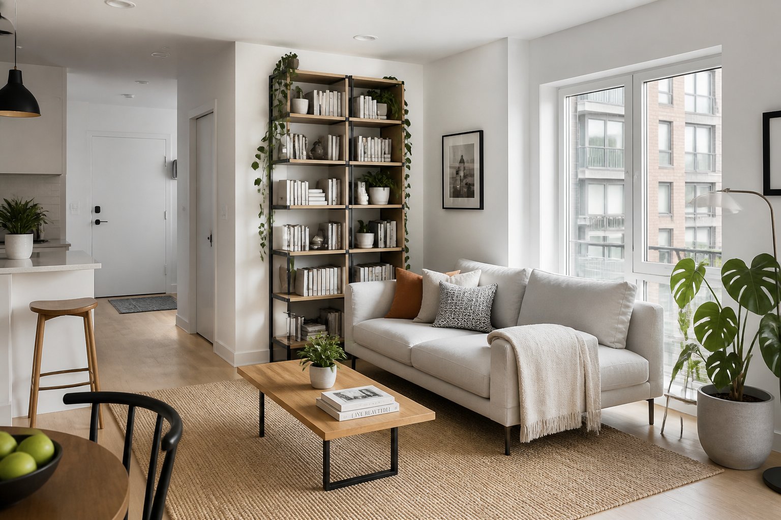
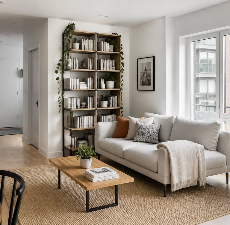
Living in a home under 1,200 square feet doesn't mean settling for less. The key to making compact spaces work is combining intelligent spatial planning with a high-low design approach that balances quality investment pieces with accessible finds, creating a home that feels both spacious and personally expressive. When you understand how to manipulate layout, light, and visual weight, you can achieve the functionality of a larger home without sacrificing style or breathing room.
The difference between a cramped space and an efficient one comes down to strategic choices. You need to think beyond basic storage solutions and consider how every element in your home serves multiple purposes while contributing to an uncluttered aesthetic. This means being selective about what enters your space and how it's positioned to maximize both utility and visual flow.
This guide will walk you through the foundations of smart spatial design, show you how to build a minimalist framework that still reflects your personality, and teach you styling techniques that create airiness without emptiness. You'll learn to make your compact residence feel generous, comfortable, and entirely yours.
Foundations of Smart Space Planning
Effective spatial design in compact residences requires intentional zoning that guides movement, vertical thinking that doubles usable area, and rooms that adapt to multiple functions throughout the day.
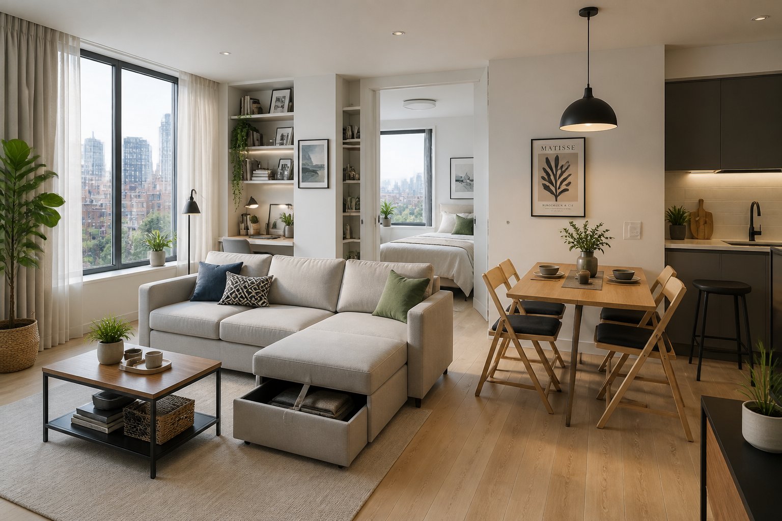
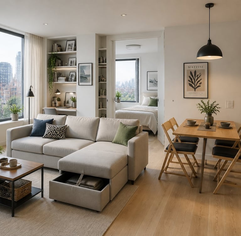
Zoning and Flow for Petite Floorplans
Define distinct areas through furniture placement rather than walls. A sofa back can separate your living zone from a dining area, while a bookshelf creates a visual boundary between sleeping and working spaces.
Position your most-used paths along the edges of rooms, not through their centers. This approach preserves functional zones and prevents the layout from feeling fragmented.
Key circulation principles:
Maintain 30-36 inches for primary walkways
Keep 24 inches minimum for secondary paths
Align doorways and passage points when possible
Use area rugs to anchor each zone visually. A 5x7 rug grounds a seating area, while a runner defines a dining spot. Color and texture shifts reinforce boundaries without physical barriers.
Consider sightlines from your entry point. The first view should extend to the farthest corner or window, creating perceived depth that makes 800 square feet read as more generous.
Vertical Solutions and Storage Integration
Built-in shelving from floor to ceiling captures dead space and draws the eye upward. Install units at 12-15 inches deep in living areas to avoid visual bulk while maximizing capacity.
Wall-mounted systems replace floor-based furniture. Floating desks, fold-down tables, and mounted nightstands preserve floor area and simplify cleaning underneath.
High-impact vertical strategies:
Mount kitchen storage to the underside of cabinets
Install hooks and rails at multiple heights in entries
Use the space above doorways for shallow display ledges
Tall, narrow furniture suits compact rooms better than low, wide pieces. A 72-inch bookcase occupies less floor space than a sprawling console while offering comparable storage.
Flex Spaces and Dual-Purpose Rooms
Your dining table becomes a workspace by day when positioned near natural light and outlets. Choose a height that functions comfortably for both meals and laptop use (29-30 inches standard).
Murphy beds or wall beds reclaim 25-30 square feet instantly. Modern mechanisms operate smoothly and pair with front-facing shelving or desks that remain functional when the bed deploys.
Guest sleeping solutions should integrate invisibly. A quality sleeper sofa serves daily living, while a daybed with bolsters functions as seating until needed for overnight stays.
Movable elements adapt to changing needs. A rolling kitchen cart stores pantry items, then serves as a bar during gatherings. Nesting tables expand surface area on demand, then tuck away completely.
Minimalism With Personality
A minimalist space under 1,200 square feet thrives when quality pieces replace quantity, textures add depth without visual weight, and personal items are displayed with intention rather than scattered throughout.
Curating Statement Pieces
Select one or two anchor pieces per room that command attention and define the space. A sculptural lounge chair in the living area or a live-edge dining table serves this purpose effectively.
Your statement pieces should be multifunctional when possible. An oversized vintage credenza provides storage while acting as a focal point. A designer floor lamp delivers both task lighting and architectural interest.
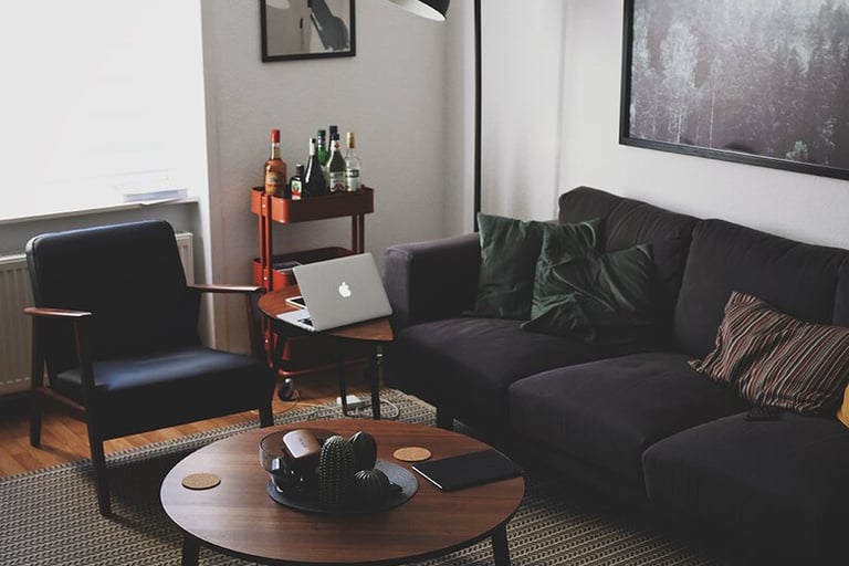
Key criteria for statement pieces:
Scale: Large enough to ground the room but proportional to the space
Quality: Superior craftsmanship that justifies the visual prominence
Versatility: Adaptable to different arrangements as your needs change
Character: Distinctive form, material, or origin that reflects your aesthetic
Budget allocation matters here. Investing 60-70% of your furniture budget in statement pieces while sourcing affordable basics creates the high-low balance that makes small spaces feel curated rather than sparse.
Layering Fine Textures and Finishes
Texture creates visual richness without adding clutter or consuming space. Layer materials with different tactile qualities to build depth across surfaces.
Pair smooth materials with rough ones deliberately. Linen curtains against matte painted walls, a boucle throw on leather seating, or a jute rug under a glass coffee table generates contrast. Each pairing should feel intentional rather than accidental.
Focus on natural materials that age gracefully. Raw oak, brushed brass, honed marble, and wool develop patina that adds character over time. These materials work in neutral palettes while introducing subtle variations in tone and finish.
Effective texture combinations:
Highlighting Art and Personal Collections
Display personal items in concentrated zones rather than distributing them throughout your space. A single gallery wall or dedicated shelf makes more impact than scattered frames.
Edit your collection to show only your strongest pieces. Rotate items seasonally if you have more than fit comfortably in your square footage. Three carefully chosen artworks outperform ten mediocre prints.
Use consistent framing or display methods to create cohesion. Black metal frames in varying sizes or floating shelves in the same finish unify disparate objects. This approach lets the items themselves provide personality while the presentation maintains minimalist principles.
For collections of smaller objects, group them on a tray or within a glass-front cabinet. This contains visual clutter while protecting items and making them feel intentional rather than accidental.
Styling for Airiness and Ambience
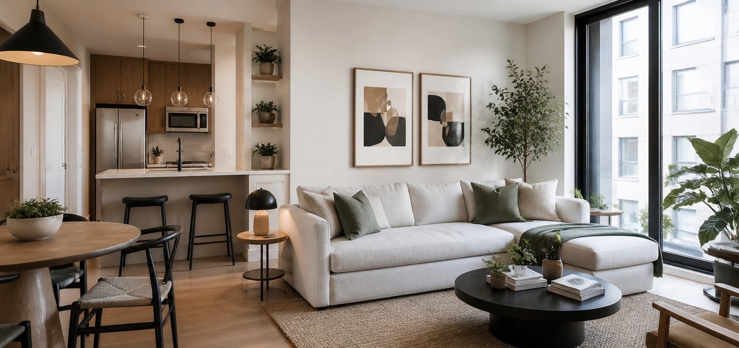
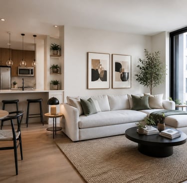
Light manipulation, color selection, and spatial flow determine whether compact rooms feel cramped or capacious. These elements work together to expand perceived square footage while establishing atmosphere.
Optimizing Natural and Layered Lighting
Maximize natural light by keeping window treatments minimal or transparent. Sheer curtains or top-down bottom-up shades give you privacy control without blocking daylight. Position mirrors opposite or adjacent to windows to bounce light deeper into rooms.
Layer your artificial lighting with three distinct types: ambient (overhead), task (desk lamps, reading lights), and accent (wall sconces, picture lights). This approach creates depth and prevents the flat, institutional feel of single-source lighting. Install dimmer switches on overhead fixtures to adjust intensity based on time of day and activity. See an example of how to customize a space's lighting in Brighten Your Home Office: Fun Lighting Ideas.
Place lamps at varying heights—floor lamps in corners, table lamps at mid-level, and wall-mounted fixtures higher up. This vertical distribution draws the eye upward and makes ceilings appear taller. Use LED bulbs between 2700 K and 3000 K for a warm residential ambience. Avoid cool-toned bulbs that make small spaces feel clinical.
Clever Use of Color and Contrast
Light neutrals expand visual space, but pure white can feel sterile in confined areas. Choose warm whites, soft grays, or pale earth tones as your base palette. Apply the same or similar tones to walls, ceilings, and trim to eliminate visual breaks that shrink rooms.
Introduce contrast strategically through furniture and accessories rather than architectural elements. A dark sofa against light walls creates focal interest without fragmenting space. Limit bold colors to items you can easily change—pillows, artwork, small furniture pieces.
Use the 60-30-10 rule: 60% dominant color (walls, large furniture), 30% secondary color (accent chairs, curtains), 10% accent color (accessories, artwork). This ratio maintains visual coherence while preventing monotony. For more information on choosing the perfect color palette, see our guide on How to Choose a Color Palette for Your Home.
Maximizing Visual Continuity
Consistent flooring throughout your residence eliminates visual barriers between rooms. If changing materials is necessary, use thin transition strips rather than thick thresholds. Area rugs should be large enough that furniture's front legs rest on them—small rugs segment space and make rooms appear smaller.
Maintain consistent sight lines by keeping furniture heights similar across connected areas. Align furniture pieces with doorways and architectural features. This creates a rhythmic flow that guides the eye smoothly through spaces.
Repeat materials, finishes, and design elements across rooms. If you use brass hardware in the kitchen, incorporate brass accents in adjacent spaces. This repetition creates visual threads that unify separate areas into one cohesive environment.
AI-generated image for inspiration purposes.
AI-generated image for inspiration purposes.
AI-generated image for inspiration purposes.
source: @thanospal
Image Credits:
Featured images include original Clever Living Spaces photography, AI-generated design concepts, and licensed images from Unsplash contributors.
Clever Living Spaces
Spatial efficiency and architectural character for small-scale living.
© 2026 Clever Living Spaces
SPATIAL FLOW & CHARACTER